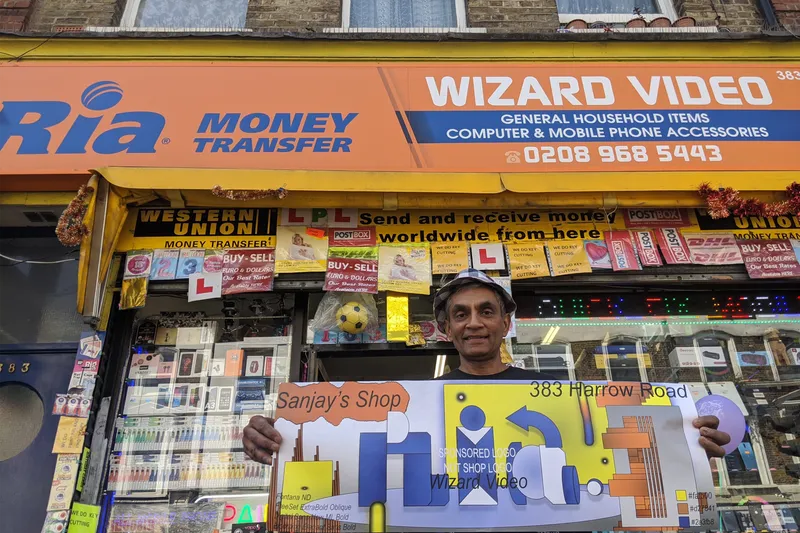
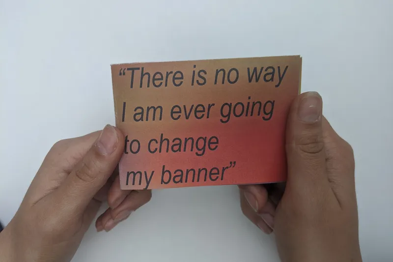
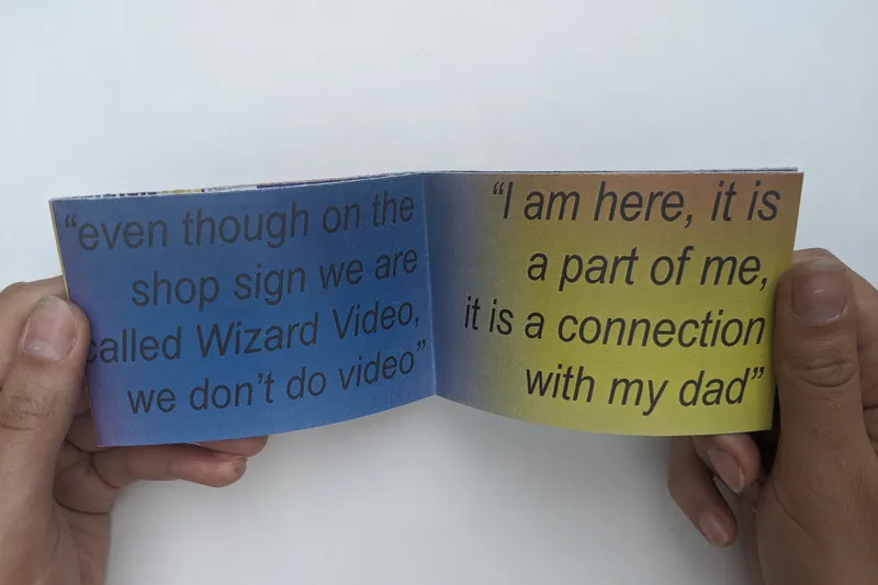
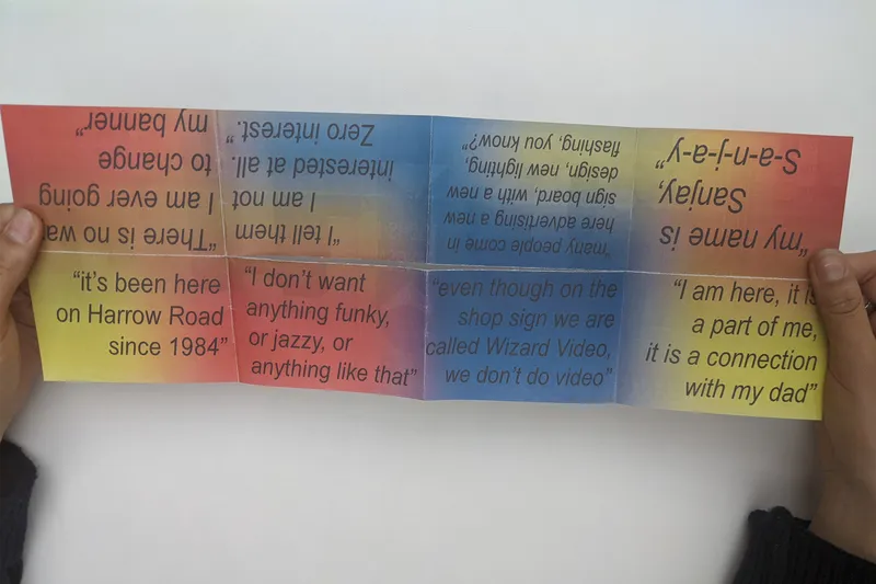
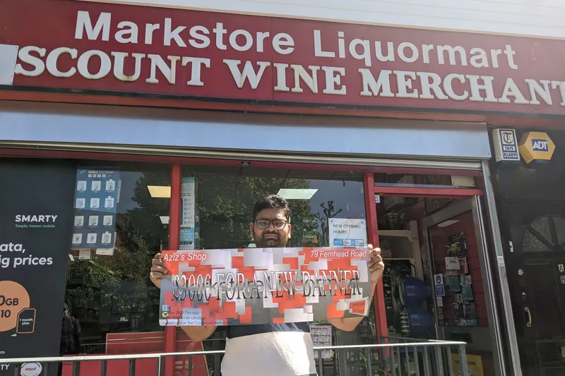
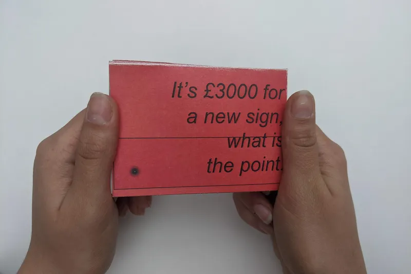
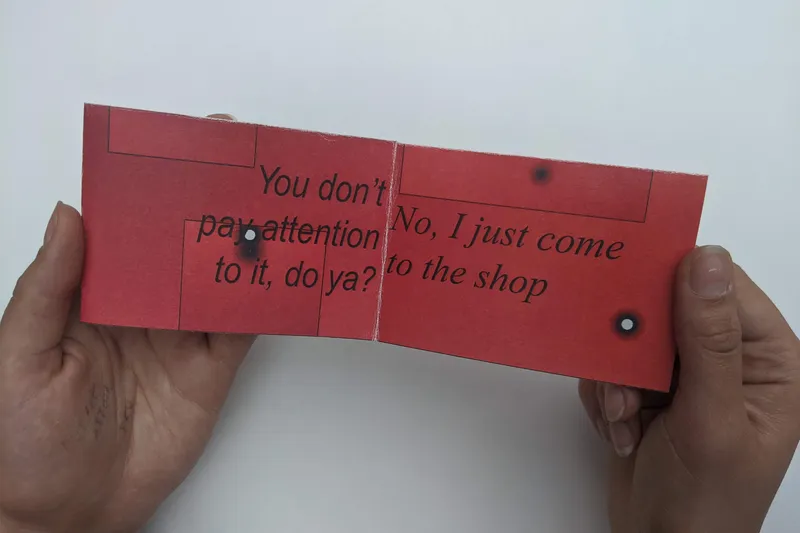
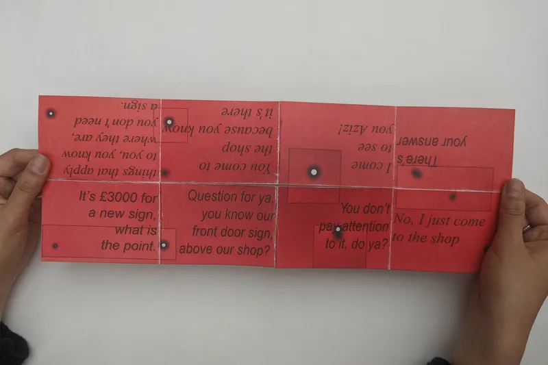
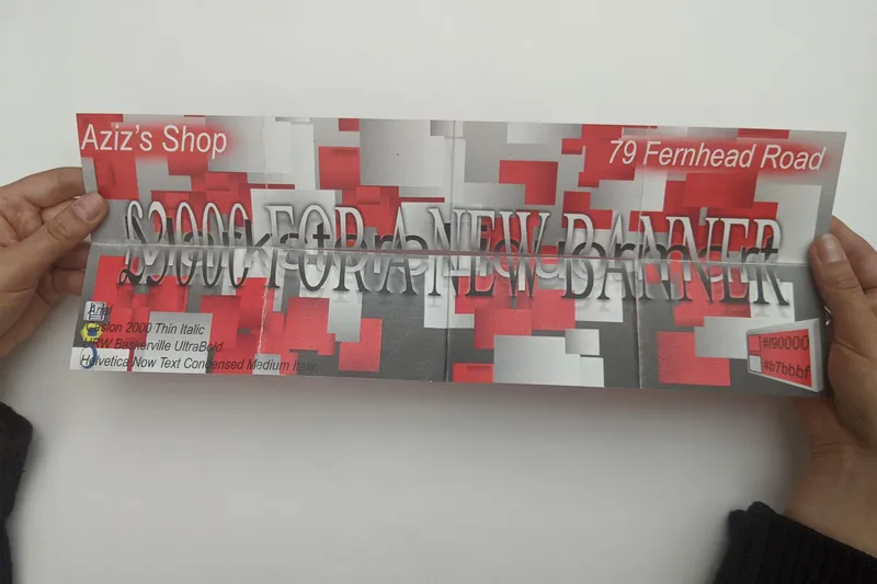
In order to predict what Future Graphic Design might look like you have to think about trends. Graphic Design trends form as a result of experimentation, errors and not being afraid to bend the ‘laws’ of Graphic Design. Corner Shop Banners can be seen to accidentally explore this anti-design concept, with their odd use of fonts and peculiar color pallets. These publications explore through quotes how from two separate shop owners, Sanjay and Aziz as they each share their contrasting thoughts on what their shop banner means to them, as well as a customer too who states that their banner is meaningless. So potentially this could shift his opinion potentially.
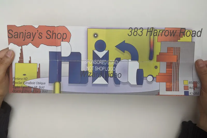
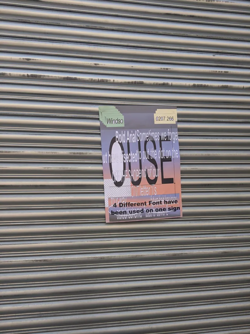
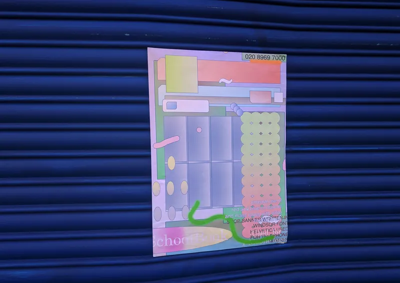
Visual language and banner artwork was inspired by the original corner shop banners’ design using their bold, peculiar and saturated color pallets or weird formats to create patterns. In no way am I trying to replace or upgrade their banners, but instead to celebrate their designs and exaggerate their features by applying my discovered Futurist concept. The Artwork cover side features design observations of exact colors they use, and a list of the countless amount of fonts used.
How far can Graphic Design ‘laws’ be pushed before it becomes ‘bad design’ and do we need ‘bad design’ to break away from a conventional and bland aesthetic, to the point that it becomes Art or trending, new, innovative design.
Corner Shop Banners are at the forefront of Experimental Graphic Design.
Made with shapes in Microsoft Powerpoint.
